All chapters
Charts & exhibits
Core toolkit - Chapter 4
04

Charts & exhibits

Use charts, tables, and exhibits to find the business meaning inside the data, quantify the key pattern, and move the case forward.

Read time
11 min
Chapter
04
Level
Core toolkit
What you'll take away
  • Read charts and exhibits without narrating every number.
  • Find and quantify the main pattern that matters for the case.
  • Turn exhibit reads into business implications and next analyses.

In the last chapter, you learned how to use numbers to make a business decision clearer.

Charts and exhibits are the same idea, just with more information on the page.

And that is exactly why they can feel intimidating. The interviewer hands you a chart, table, graph, or slide. Suddenly there are labels, axes, numbers, segments, maybe a legend, maybe a footnote, and maybe a quiet little panic in your chest.

Do not start by reading everything
The chart is not the answer. The so-what is the answer.

The intuition

Charts are not there for you to describe.

They are there for you to find the business meaning inside the data.

If the client asks why profits dropped, and the interviewer shows you revenue by region, your job is not to say:

Region A went up, Region B went down, Region C went up slightly.

Your job is to say:

The useful read
The decline is concentrated in Region B, which means this probably is not a company-wide problem. I would investigate what changed in Region B first.

One is a description. The other moves the case forward.

Why it matters

Exhibits test several skills at once:

  • Can you stay calm when new information appears?
  • Can you orient yourself quickly?
  • Can you separate signal from noise?
  • Can you quantify the important change?
  • Can you connect data back to the client's question?
  • Can you decide what to do next?

This is why exhibit reading is such a sharp case skill. In 60 seconds, the interviewer can see whether you are just looking at data or actually using it.

A strong exhibit read sounds like
Here is what this chart shows. Here is the key pattern. Here is the number that proves it. Here is what it means for the case. Here is what I would check next.

The core moves

Exhibit loopUse the same loop every time
  1. 1
    OrientWhat am I looking at?
  2. 2
    FindWhat is the main pattern?
  3. 3
    QuantifyWhat number proves it?
  4. 4
    InterpretSo what for the case?
  5. 5
    MoveWhat should we analyze next?
Do not narrate the chart. Use the chart.
Sentence frame
This exhibit shows [what], over [time period], by [segment]. The key takeaway is [main pattern], shown by [number]. That matters because [business implication], so I would next look at [next analysis].

You will not say it this mechanically forever. But early on, this frame gives your brain a rail to run on when the exhibit first lands.

Throughout this chapter, we will keep using the coffee chain example: a coffee chain whose profits dropped 15% last quarter. Imagine the interviewer gives you this exhibit:
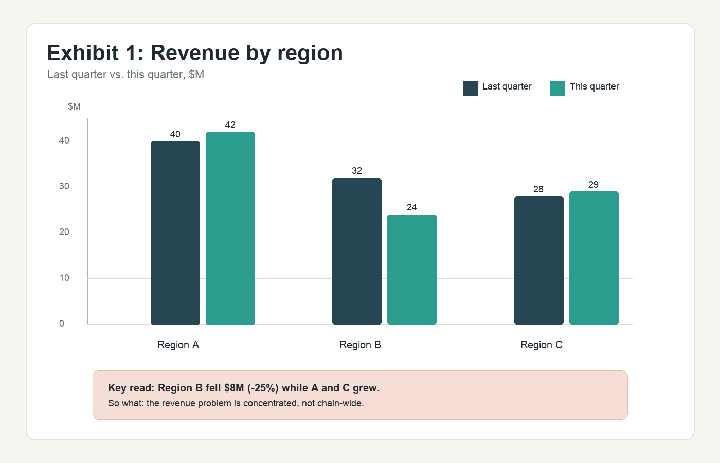
Grouped bar chart showing coffee chain revenue by region last quarter versus this quarter
Revenue by region, last quarter versus this quarter.

1. Orient: what am I looking at?

Before you hunt for insights, know what the exhibit is showing.

Read the basics:

  • Title.
  • Axes or row and column labels.
  • Units.
  • Time period.
  • Segments.
  • Footnotes or definitions.
Coffee-chain orientation
This table shows revenue by region, comparing last quarter to this quarter, in millions of dollars.

That is enough orientation. Do not spend 30 seconds reading every number aloud.

2. Find: what is the main pattern?

Most exhibits have one message trying to get out.

Look for:

  • The biggest increase.
  • The biggest decline.
  • The outlier.
  • The trend over time.
  • The gap between groups.
  • The segment driving most of the change.

In the coffee chain exhibit, Region A grew from $40M to $42M. Region C grew from $28M to $29M. Region B fell from $32M to $24M.

Lead with the insight
Region B is the problem.

3. Quantify: what number proves it?

Insight gets sharper when you put a number on it.

Too vague

Region B declined a lot.

Sharper

Region B revenue fell from $32M to $24M, which is an $8M decline, or 25%.

That one number does real work. It shows the decline is large, concentrated, and likely meaningful. You do not need to quantify everything. Quantify what matters.

4. Interpret: so what for the case?

This is what interviewers are really testing
The interviewer does not need you to prove you can read a table. They need you to tell them what it means for the business problem.
Coffee-chain implication
Since Region A and Region C are stable or growing, the profit decline does not look like a broad company-wide revenue issue. It looks concentrated in Region B.

Now the exhibit has changed your case direction. You are no longer asking, "Why did profits drop everywhere?" You are asking, "What changed in Region B?"

5. Move: what should we analyze next?

A strong exhibit read ends with direction. Once you know Region B is the issue, ask what would explain it:

  • Did customer traffic fall?
  • Did average order value decline?
  • Did a competitor open nearby?
  • Did prices change?
  • Did delivery mix shift?
  • Did stores close or reduce hours?
  • Did local costs increase?
Next analysis
I would next investigate Region B specifically, starting with traffic and average order value, then checking whether there was a local competitor, channel shift, or operational issue.

The chart gave you a sharper next step.

What weak looks like

Weak exhibit read · describing without using
AI
Prompt
The coffee chain's profits dropped 15% last quarter. The interviewer shows you revenue by region.
YOU
Weak answer
This table shows Region A, Region B, and Region C. Region A went from $40 million to $42 million. Region B went from $32 million to $24 million. Region C went from $28 million to $29 million. So some regions went up and one went down.
Why it falls flat
The candidate reads numbers, but does not identify the main driver, quantify the decline clearly, connect it to the profit problem, or suggest the next analysis.

What strong looks like

Strong exhibit read · insight, proof, implication, next step
AI
Prompt
The coffee chain's profits dropped 15% last quarter. The interviewer shows you revenue by region.
YOU
Strong answer
This table compares revenue by region from last quarter to this quarter, in millions of dollars. The key takeaway is that the revenue decline is concentrated in Region B. Region B fell from $32 million to $24 million, an $8 million decline, or 25%, while Regions A and C were stable or growing. That suggests the broader profit issue may be driven by a localized problem in Region B rather than a company-wide revenue decline. I would next look at what changed in Region B, starting with traffic, average order value, competition, and channel mix.
Brief orientation, main insight, quantified proof, business implication, and next analysis.

That is exhibit reading.

Common exhibit types

You do not need to memorize every chart type, but it helps to know what each one usually wants from you.

Exhibit typesWhere to look first
Line chart
Trend
Trend over time, inflection points, acceleration or slowdown
Bar chart
Comparison
Differences across groups, biggest or smallest categories
Stacked bar
Mix
Mix shift, composition, which segment drives the total
Pie chart
Share
Share of total, concentration, relative size
Table
Calculate
Outliers, ratios, changes, hidden calculations
Scatter plot
Relationship
Relationship between two variables, clusters, outliers
Bubble chart
Relationship + size
Relationship plus a third variable, often market size or revenue
Waterfall
Bridge
What adds to or subtracts from a total
Heatmap / matrix
Concentration
Where the issue is concentrated across two dimensions
Dense dashboard
Filter
Multiple charts or tables that require filtering
The type tells you where to look first. The standard is always: what does this tell us about the case question?

Exhibit gallery: what this can look like

Real case exhibits rarely announce themselves as easy. Sometimes you get a clean chart. Sometimes you get a dense slide with three things happening at once. Sometimes the data is simple, but the trap is subtle: percentages instead of dollars, mix instead of total, growth in a small segment hiding decline in a big one.

Train the loop
Orient - Find - Quantify - Interpret - Move

1. Grouped bar chart: compare across categories.

Grouped bar chart showing coffee chain revenue by region
One metric, two periods, three segments.

What it tests: can you avoid reading every bar and lead with the one that matters?

What strong sounds like
This exhibit compares revenue by region from last quarter to this quarter. The key takeaway is that the decline is concentrated in Region B, which fell from $32M to $24M, an $8M decline or 25%, while Regions A and C grew slightly. That suggests the issue is not chain-wide. I would next investigate what changed in Region B.

The trap: treating the chart as three separate facts instead of one business pattern.

2. Stacked bar chart: separate total change from mix change.
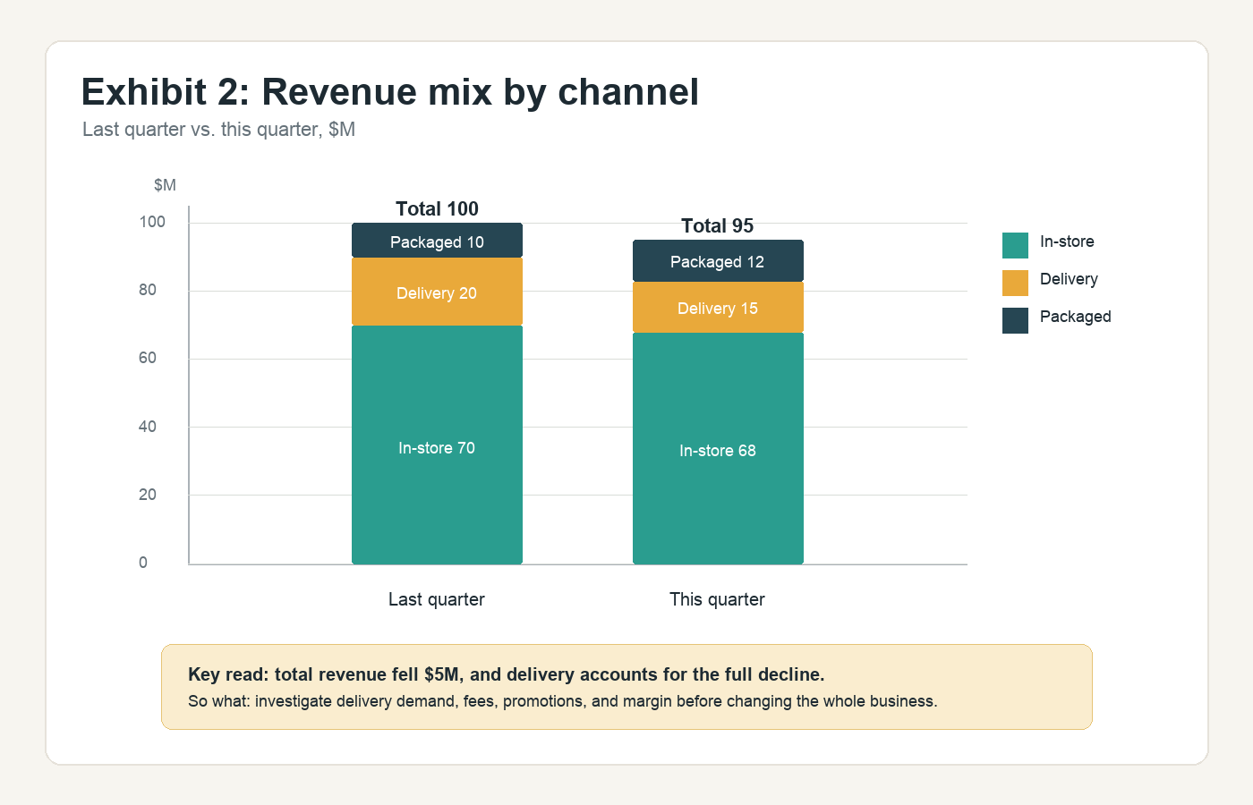
Stacked bar chart showing revenue mix by channel
Stacked bars ask you to read total change and segment mix at the same time.

What it tests: can you distinguish total decline from mix shift?

What strong sounds like
Total revenue fell from $100M to $95M. The biggest driver is delivery, which dropped from $20M to $15M. In-store revenue fell slightly, and packaged products grew, so I would not treat this as a broad demand issue yet. I would look first at delivery volume, fees, promotions, and profitability.

The trap: staring at the colors and missing the total, or only seeing the total and missing the segment driving it.

3. Line chart: find the inflection point.
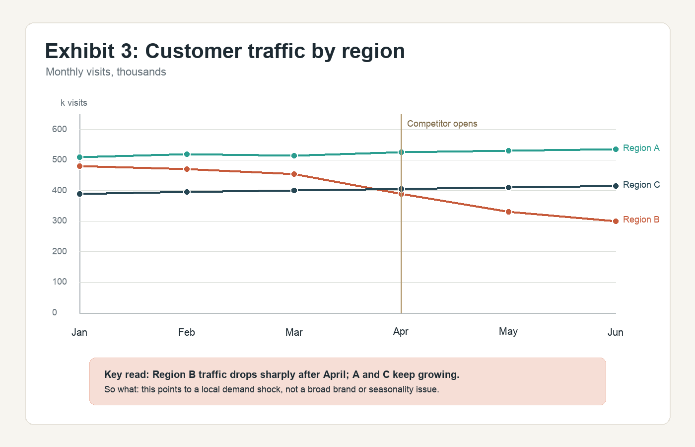
Line chart showing customer traffic by region over time
Line charts are usually about what changed, when it changed, and why that timing matters.

What it tests: can you spot a turning point and connect it to the case?

What strong sounds like
Region B traffic starts falling sharply after April, while Regions A and C stay stable or grow. Since the timing lines up with the competitor opening, my working view is that the profit decline may be driven by a local competitive hit in Region B. I would test whether the drop came from lower visits, lower conversion, or lower average order value.

The trap: describing each line separately and missing the moment the case changed.

4. Waterfall chart: explain the bridge.
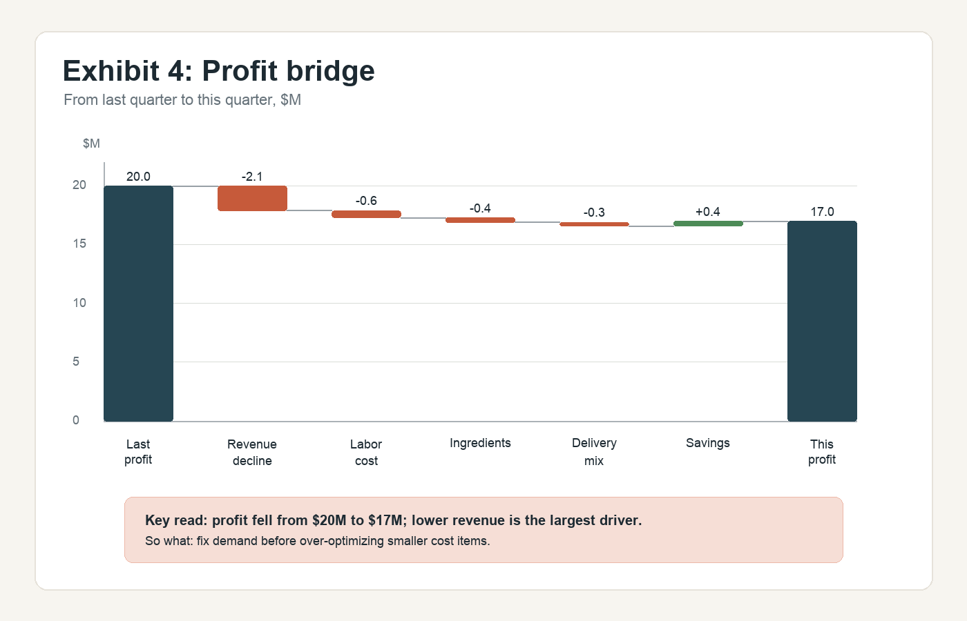
Waterfall chart showing profit bridge from last quarter to this quarter
Waterfalls separate the drivers that add to or subtract from a total.

What it tests: can you identify the largest bridge item and decide whether the problem is revenue, cost, or both?

What strong sounds like
Profit fell from $20M to $17M. The largest driver is the $2.1M revenue decline; the cost increases are real but smaller. That means I would focus first on diagnosing the demand or revenue issue, then check whether labor, ingredients, and delivery mix are worsening the margin once volume is understood.

The trap: treating every bridge item equally.

5. Scatter or bubble chart: look for clusters and outliers.
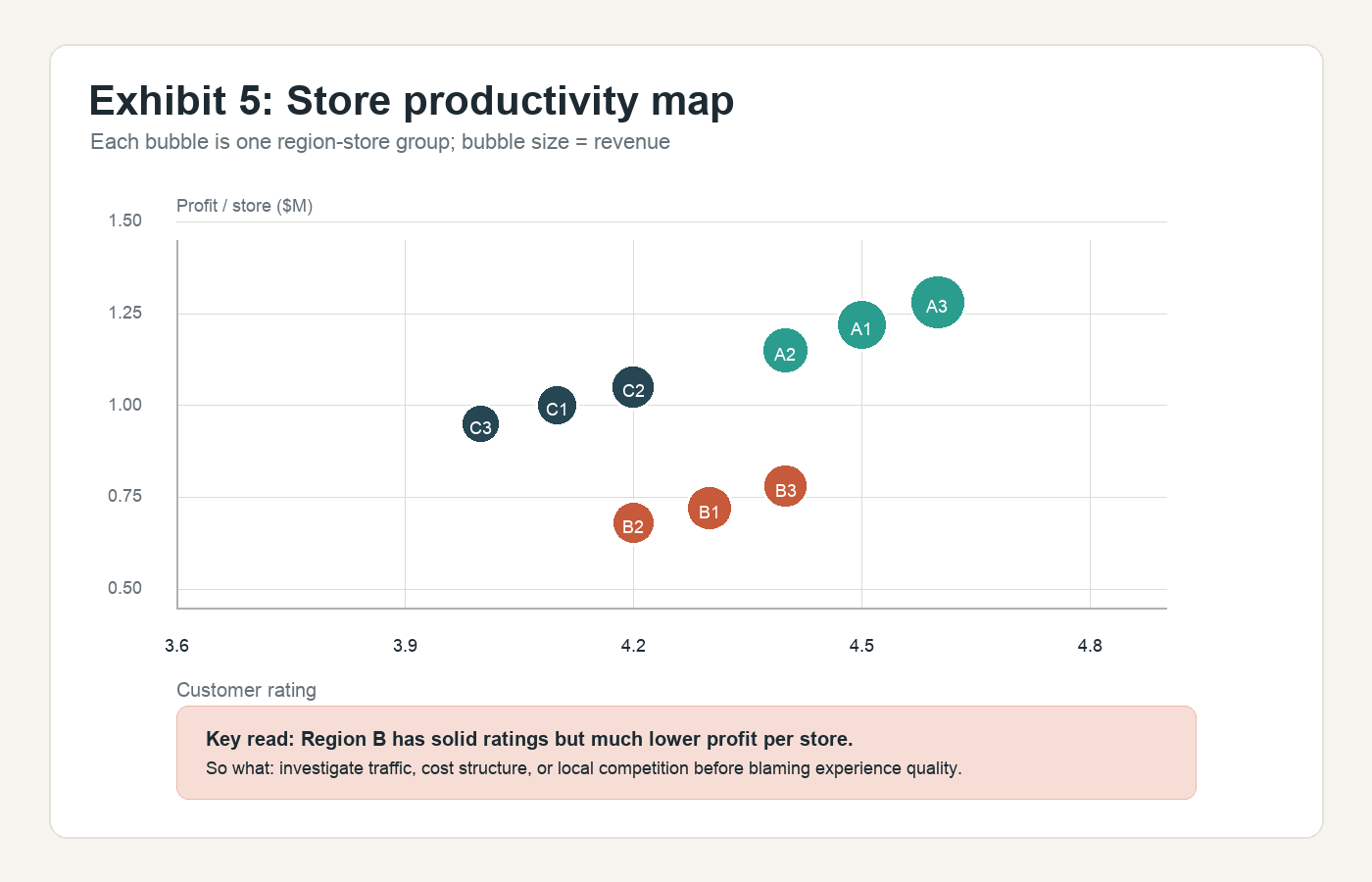
Scatter bubble chart showing store productivity and customer rating
Start by asking what each axis means, what bubble size means, and whether the points form clusters.

What it tests: can you see relationships, clusters, and exceptions?

What strong sounds like
Region B stores have decent customer ratings, but much lower profit per store than Regions A and C. That suggests customer satisfaction may not be the primary issue. I would investigate whether Region B has lower traffic, weaker average order value, higher costs, or more local competition.

The trap: assuming correlation is causation. A scatter plot gives you a pattern to investigate, not a final explanation.

6. Heatmap or dense matrix: filter the noise.
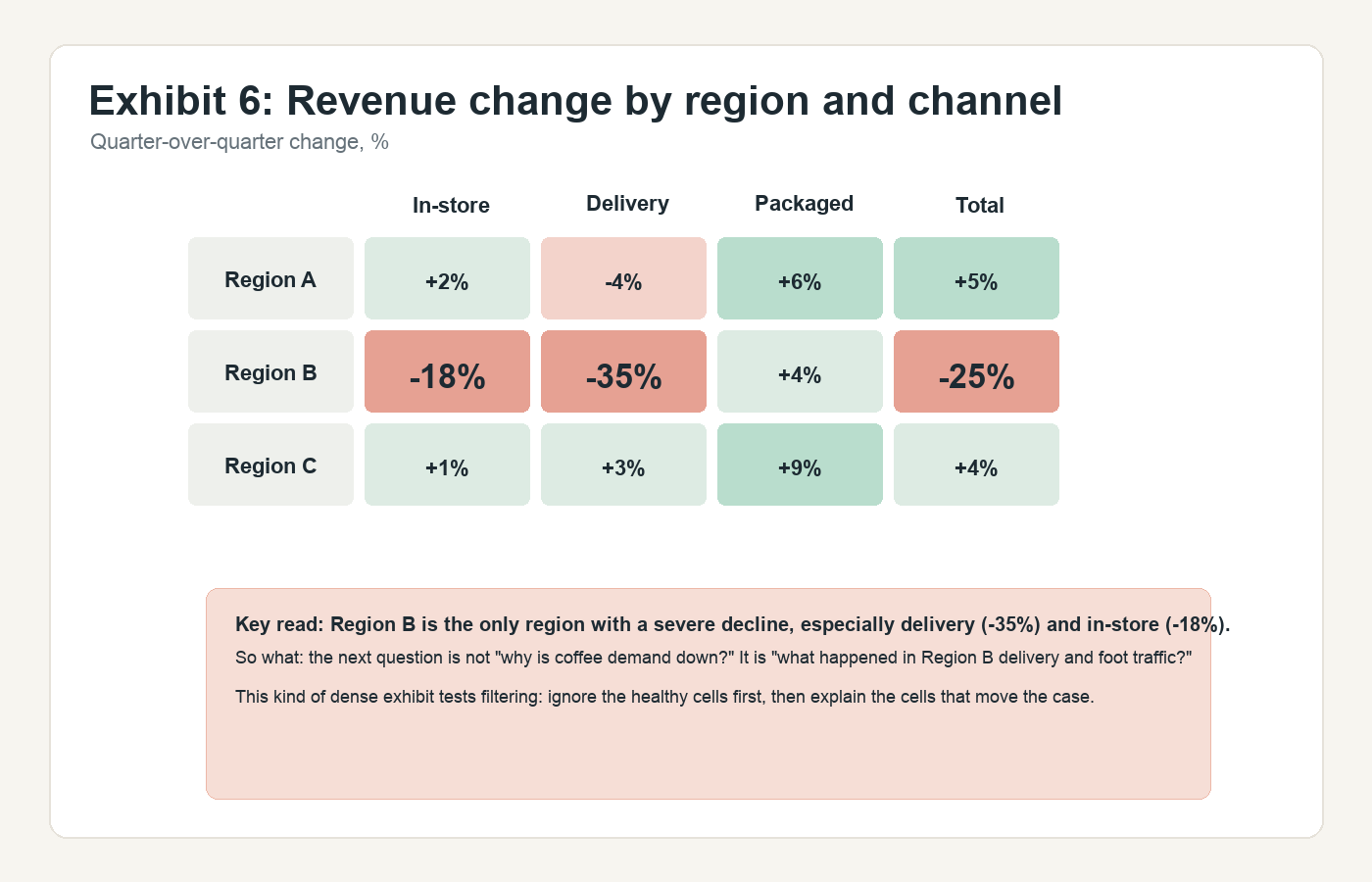
Heatmap showing revenue change by region and channel
Dense exhibits reward filtering, not completeness.

What it tests: can you find where the issue is concentrated?

What strong sounds like
This matrix shows quarter-over-quarter revenue change by region and channel. The key pattern is that Region B is the only region with a severe total decline, down 25%. Within Region B, delivery is down 35% and in-store is down 18%, while packaged is slightly up. I would focus the next analysis on Region B delivery and foot traffic, rather than spending time on the healthier regions.

The trap: trying to explain every cell.

The job stays the same
Find the business meaning and move the case forward.

Common traps

The usual ways exhibit reading goes wrong
  • Reading every number aloud.
  • Ignoring the title or units.
  • Missing the biggest pattern.
  • Describing instead of interpreting.
  • Forgetting to quantify the key change.
  • Forcing a conclusion the data does not support.
  • Moving on without saying what to analyze next.

The most dangerous trap is treating the exhibit like a reading comprehension exercise. It is not. It is a decision tool.

How to handle a dense exhibit

Sometimes the interviewer gives you a chart or table with too much information. Do not panic.

Dense exhibitSlow the beginning down
  1. 1
    Ask for a momentGive yourself permission to read.
  2. 2
    Read the basicsTitle, units, and segments.
  3. 3
    Reconnect to the caseWhat question are we answering?
  4. 4
    Find the biggest patternLook for what changes the case.
  5. 5
    Ignore irrelevant detailFilter what does not matter yet.
Controlled pause
Let me take a moment to read this exhibit and identify what matters most for the profit decline.

Dense exhibits are designed to test whether you can filter. The goal is not to process everything. The goal is to find the part that changes the case.

Up next
Chapter 5 · Synthesis & recommendation
Next, learn how to turn the facts, math, and exhibits you found into a clear answer, with evidence, risks, and next steps.
Continue to Chapter 5
Finished Chapter 4?Mark it complete to track your progress through the handbook.